The Arhatic Yoga Retreat is a much-anticipated annual event that combines the practice of meditation and yoga to provide a holistic experience for the attendees. It is organized by the World Pranic Healing and Institute of Inner Studies and is held in various locations across the globe.
In 2015, the retreat was held in Kochi, Kerala, and the organizers wanted a distinctive logo and brand identity for the event. As a creative designer, I was tasked with coming up with a logo that embodied the essence of the Arhatic yoga programs and the Pranic Healing school.
To achieve this, I spent time researching and studying the Arhatic yoga programs, as well as the philosophy and teachings of the Pranic Healing school. This research enabled me to get a deeper understanding of the retreat’s objectives and helped me develop a clear vision for the branding.
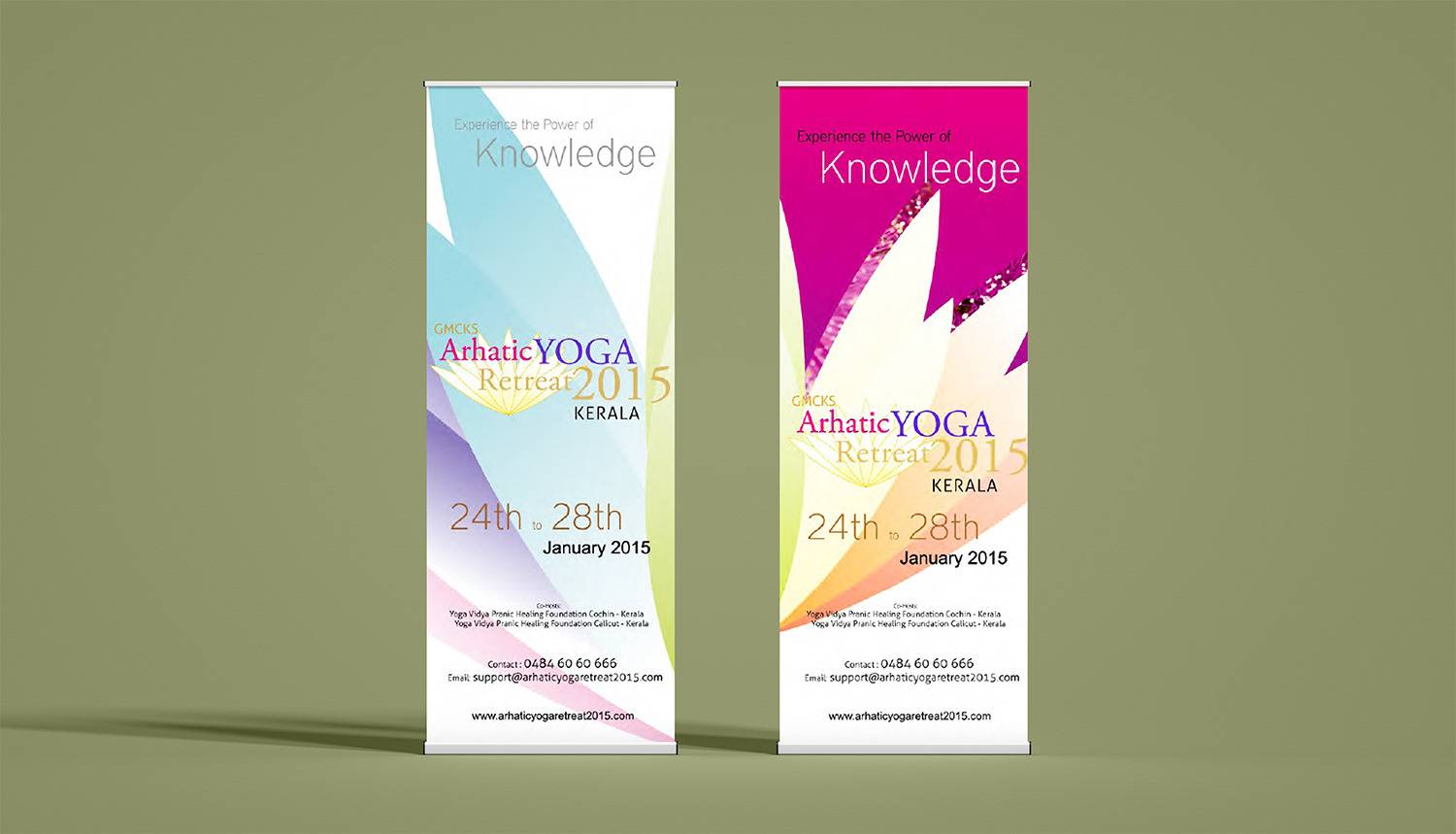
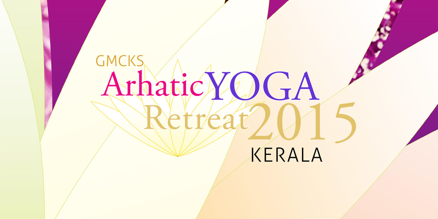
After conducting my research, I presented several logo options and retreat identities to the foundation trustees and decision-makers. They were impressed with the options presented, but they ultimately chose a logo with vibrant colors and an open lotus symbol that represented the awakening of higher intelligence.
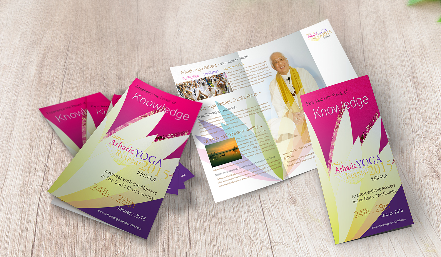
The open lotus symbol signifies the opening of one’s consciousness and the realization of higher spiritual truths. The vibrant colors used in the logo, such as shades of blue and purple, represent tranquility, peace, and spiritual harmony.
Once the logo was selected, I refined it further and developed the final branding for the event. The final logo was widely accepted and reflected the international event’s identity, capturing the essence of the Arhatic yoga programs and the Pranic Healing school’s teachings.
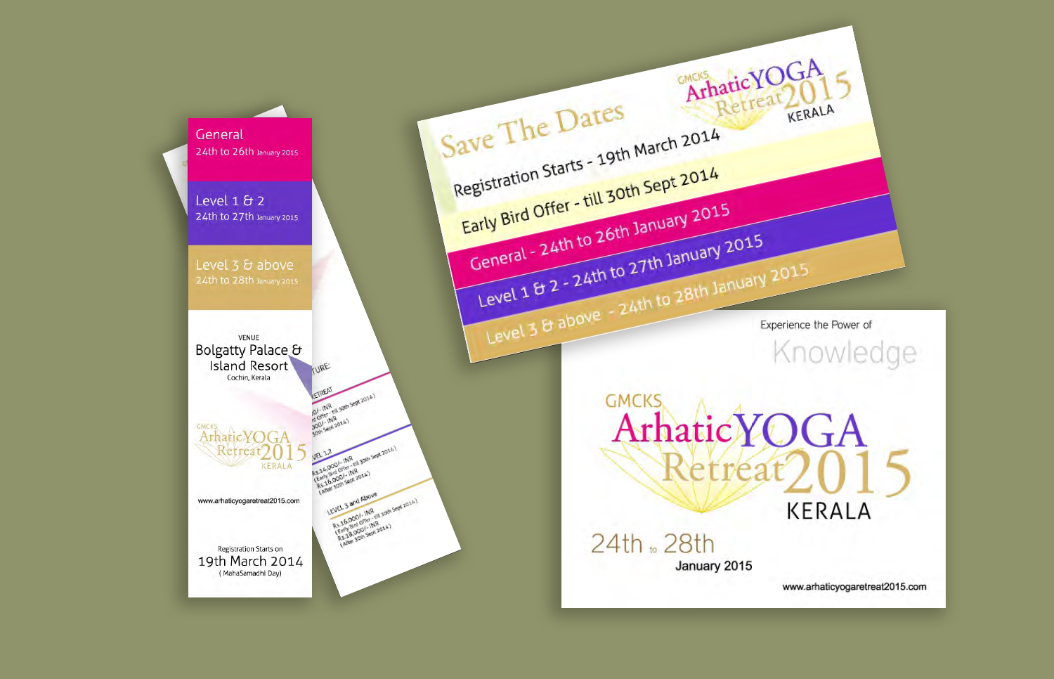
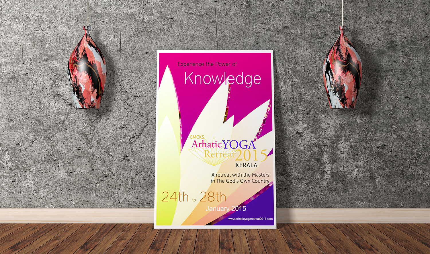
Along with the branding, I created several other materials such as stationery, registration forms, marketing collateral, posters, and standees. These materials were designed to complement the branding and create a consistent visual identity for the event.
The 2015 Arhatic Yoga Retreat was a visually stunning and enriching experience for all the attendees. The branding created a sense of coherence and provided a unifying visual identity for the retreat. Working with the Pranic Healing team and their concepts of energy and spiritual development was an inspiring experience that I thoroughly enjoyed.
